CSS stands for Cascading Style Sheets
CSS is the language we use to style a Web page.
CSS describes how HTML elements are to be displayed on screen, paper, or in other media.
CSS is used to define styles for your web pages, including the design, layout and variations in display for different devices and screen sizes.
HTML was NEVER intended to contain tags for formatting a web page!
HTML was created to describe the content of a web page, like:
<h1>This is a heading</h1>

<p>This is a paragraph.</p>
When tags like <font> and color attributes were added to the HTML 3.2 specification, it started a nightmare for web developers.
Development of large websites, where fonts and color information were added to every single page, became a long and expensive process.
To solve this problem, the World Wide Web Consortium (W3C) created CSS.
CSS removed the style formatting from the HTML page!
With an external stylesheet file, you can change the look of an entire website by changing just one file!
A CSS rule consists of a selector and a declaration block.
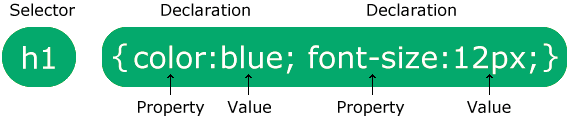
The selector points to the HTML element you want to style.
The declaration block contains one or more declarations separated by semicolons.
Each declaration includes a CSS property name and a value, separated by a colon.
Multiple CSS declarations are separated with semicolons, and declaration blocks are surrounded by curly braces.
    p {
      color: red;
      text-align: center;
    }
p is a selector in CSS it points to the HTML element you want to style.
color is a property, and red is the property value.
text-align is a property, and center is the property value.
When a browser reads a style sheet, it will format the HTML document according to the information in the style sheet.
There are three ways of inserting a style sheet:
1. Inline CSS
2. Internal CSS
3. External CSS
An inline style may be used to apply a unique style for a single element.
To use inline styles, add the style attribute to the relevant element. The style attribute can contain any CSS property.
  <!DOCTYPE html>
  <html>

  <head>
    <title>Inline CSS</title>
  </head>

  <body>
    <h1 style="color:blue;text-align:center;">This is  Inline CSS</h1>
    <p style="color:red;">This is  Inline CSS.</p>
  </body>

  </html>
An internal style sheet may be used if one single HTML page has a unique style.
The internal style is defined inside the <style> element, inside the <head> section.
  <!DOCTYPE html>
  <html>

  <head>
    <title>Internal CSS</title>
    <style>
      h1 {
        background-color: teal;
        color: white;
        text-align: center;
      }

      p {
        color: grey;
      }
    </style>
  </head>

  <body>
    <h1>This is Internal Style Sheets</h1>
    <p>This is Internal Style Sheets</p>
  </body>

  </html>
With an external style sheet, you can change the look of an entire website by changing just one file!
An external style sheet can be written in any text editor, and must be saved with a .css extension.
The external .css file should not contain any HTML tags.
Here is how the "mystyle.css" file looks:
  body {
  background-color: lightblue;
  }

  h1 {
  color: navy;
  margin-left: 20px;
  }
Each HTML page must include a reference to the external style sheet file inside the <link> element, inside the <head> section.
  <!DOCTYPE html>
  <html>

  <head>
    <title>External CSS</title>
    <link rel="stylesheet" href="mystyle.css">
  </head>

  <body>
    <h1>This is External Style Sheets</h1>
    <p>This is External Style Sheets</p>
  </body>

  </html>
CSS selectors are used to "find" (or select) the HTML elements you want to style. There are the following types of CSS Selectors:
1. CSS Universal Selector ( * )
2. CSS Element Selector ( p )
3. CSS Id Selector ( # )
4. CSS Class Selector ( . )
5. CSS Grouping Selector ( , )
6. CSS Combinators Selector ( space , >, + , ~ )
7. CSS Attribute Selectors ( [ ] )
8. CSS Pseudo-class Selectors ( : )
9. CSSPseudo-elements Selectors ( : : )
The universal selector ( * ) selects all HTML elements on the page.
  <!DOCTYPE html>
  <html>

  <head>
    <title>CSS Basics</title>
    <style>
      * {
        text-align: center;
        color: blue;
      }
    </style>
  </head>

  <body>
    <h1>Hello world!</h1>

    <p>Every element on the page will be affected by the style.</p>
    <p id="para1">Me too!</p>
    <p>And me!</p>
  </body>

  </html>
The element selector selects HTML elements based on the element name.
  <!DOCTYPE html>
  <html>

  <head>
    <title>CSS Basics</title>
    <style>
      p {
        text-align: center;
        color: red;
      }
    </style>
  </head>

  <body>
    <p>Every paragraph will be affected by the style.</p>
    <p id="para1">Me too!</p>
    <p>And me!</p>
  </body>

  </html>
The id selector uses the id attribute of an HTML element to select a specific element.
The id of an element is unique within a page, so the id selector is used to select one unique element!
To select an element with a specific id, write a hash (#) character, followed by the id of the element.
  <!DOCTYPE html>
  <html>

  <head>
    <title>CSS Basics</title>
    <style>
      #para1 {
        text-align: center;
        color: red;
      }
    </style>
  </head>

  <body>
    <p id="para1">Hello World!</p>
    <p>This paragraph is not affected by the style.</p>
  </body>

  </html>
The class selector selects HTML elements with a specific class attribute.
To select elements with a specific class, write a period (.) character, followed by the class name.
  <!DOCTYPE html>
  <html>

  <head>
    <title>CSS Basics</title>
    <style>
      .center {
        text-align: center;
        color: red;
      }
    </style>
  </head>

  <body>

    <h1 class="center">Red and center-aligned heading</h1>
    <p class="center">Red and center-aligned paragraph.</p>

  </body>

  </html>
The grouping selector selects all the HTML elements with the same style definitions.
Look at the following CSS code (the h1, h2, and p elements have the same style definitions):
  <!DOCTYPE html>
  <html>

  <head>
    <title>CSS Basics</title>
    <style>
      h1, h2, p {
        text-align: center;
        color: red;
      }
    </style>
  </head>

  <body>

    <h1>Hello World!</h1>
    <h2>Smaller heading!</h2>
    <p>This is a paragraph.</p>

  </body>

  </html>
A combinator is something that explains the relationship between the selectors.
A CSS selector can contain more than one simple selector. Between the simple selectors, we can include a combinator.
There are four different combinators in CSS:
I. Descendant combinator (space)
The descendant combinator matches all elements that are descendants of a specified element.
The following example selects all <p> elements inside <div> elements:
  <!DOCTYPE html>
  <html>

  <head>
    <title>CSS Basics</title>
    <style>
      div p {
        background-color: yellow;
      }
    </style>
  </head>

  <body>

    <h2>Descendant Selector</h2>

    <p>The descendant selector matches all elements that are descendants of a specified element.</p>

    <div>
      <p>Paragraph 1 in the div.</p>
      <p>Paragraph 2 in the div.</p>
      <section>
        <p>Paragraph 3 in the div.</p>
      </section>
    </div>

    <p>Paragraph 4. Not in a div.</p>
    <p>Paragraph 5. Not in a div.</p>

  </body>

  </html>
II. Child combinator (>)
The child combinator selects all elements that are the children of a specified element.
The following example selects all <p> elements that are children of a <div> element:
  <!DOCTYPE html>
  <html>

  <head>
    <title>CSS Basics</title>
    <style>
      div>p {
        background-color: yellow;
      }
    </style>
  </head>

  <body>

    <h2>Child Selector</h2>

    <p>The child selector (>) selects all elements that are the children of a specified element.</p>

    <div>
      <p>Paragraph 1 in the div.</p>
      <p>Paragraph 2 in the div.</p>
      <section>
        <!-- not Child but Descendant -->
        <p>Paragraph 3 in the div (inside a section element).</p>
      </section>
      <p>Paragraph 4 in the div.</p>
    </div>

    <p>Paragraph 5. Not in a div.</p>
    <p>Paragraph 6. Not in a div.</p>

  </body>

  </html>
III. Next sibling combinator (+)
The next sibling combinator is used to select an element that is directly after another specific element.
Sibling elements must have the same parent element, and "adjacent" means "immediately following".
The following example selects the first <p> element that are placed immediately after <div> elements:
  <!DOCTYPE html>
  <html>

  <head>
    <title>CSS Basics</title>
    <style>
      div+p {
        background-color: yellow;
      }
    </style>
  </head>

  <body>

    <h2>Adjacent Sibling Selector</h2>

    <p>The + selector is used to select an element that is directly after another specific element.</p>
    <p>The following example selects the first p element that are placed immediately after div elements:</p>

    <div>
      <p>Paragraph 1 in the div.</p>
      <p>Paragraph 2 in the div.</p>
    </div>

    <p>Paragraph 3. After a div.</p>
    <p>Paragraph 4. After a div.</p>

    <div>
      <p>Paragraph 5 in the div.</p>
      <p>Paragraph 6 in the div.</p>
    </div>

    <p>Paragraph 7. After a div.</p>
    <p>Paragraph 8. After a div.</p>

  </body>

  </html>
IV. Subsequent-sibling combinator (~)
The subsequent-sibling combinator selects all elements that are next siblings of a specified element.
The following example selects all <p> elements that are next siblings of <div> elements:
  <!DOCTYPE html>
  <html>

  <head>
    <title>CSS Basics</title>
    <style>
      div~p {
        background-color: yellow;
      }
    </style>
  </head>

  <body>

    <h2>General Sibling Selector</h2>

    <p>The general sibling selector (~) selects all elements that are next siblings of a specified element.</p>

    <p>Paragraph 1.</p>

    <div>
      <p>Paragraph 2.</p>
    </div>

    <p>Paragraph 3.</p>
    <code>Some code.</code>
    <p>Paragraph 4.</p>

  </body>

  </html>
It is possible to style HTML elements that have specific attributes or attribute values.
CSS [attribute] Selector
The [attribute] selector is used to select elements with a specified attribute.
The following example selects all <a> elements with a target attribute:
  <!DOCTYPE html>
  <html>

  <head>
    <style>
      a[target] {
        background-color: yellow;
      }
    </style>
  </head>

  <body>

    <h2>CSS [attribute] Selector</h2>
    <p>The links with a target attribute gets a yellow background:</p>

    <a href="https://www.deepakrajtech.com">deepakrajtech.com</a>
    <a href="http://www.disney.com" target="_blank">disney.com</a>
    <a href="http://www.wikipedia.org" target="_top">wikipedia.org</a>

  </body>

  </html>
CSS [attribute="value"] Selector
The [attribute="value"] selector is used to select elements with a specified attribute and value.
The following example selects all <a> elements with a target="_blank" attribute:
  <!DOCTYPE html>
  <html>

  <head>
    <style>
      a[target="_blank"] {
        background-color: yellow;
      }
    </style>
  </head>

  <body>

    <h2>CSS [attribute="value"] Selector</h2>
    <p>The link with target="_blank" gets a yellow background:</p>

    <a href="https://www.deepakrajtech.com">deepakrajtech.com</a>
    <a href="http://www.disney.com" target="_blank">disney.com</a>
    <a href="http://www.wikipedia.org" target="_top">wikipedia.org</a>

  </body>

  </html>
CSS [attribute~="value"] Selector
The [attribute~="value"] selector is used to select elements with an attribute value containing a specified word.
The following example selects all elements with a title attribute that contains a space-separated list of words, one of which is "flower":
  <!DOCTYPE html>
  <html>

  <head>
    <style>
      [title~="flower"] {
        border: 5px solid yellow;
      }
    </style>
  </head>

  <body>

    <h2>CSS [attribute~="value"] Selector</h2>
    <p>All images with the title attribute containing the word "flower" get a yellow border.</p>

    <img src="klematis.jpg" title="klematis flower" width="150" height="113">
    <img src="img_flwr.gif" title="flower" width="224" height="162">
    <img src="img_tree.gif" title="tree" width="200" height="358">

  </body>

  </html>
CSS [attribute|="value"] Selector
The [attribute|="value"] selector is used to select elements with the specified attribute, whose value can be exactly the specified value, or the specified value followed by a hyphen (-).
Note: The value has to be a whole word, either alone, like class="top", or followed by a hyphen( - ), like class="top-text".
  <!DOCTYPE html>
  <html>

  <head>
    <style>
      [class|="top"] {
        background: yellow;
      }
    </style>
  </head>

  <body>

    <h2>CSS [attribute|="value"] Selector</h2>

    <h1 class="top-header">Welcome</h1>
    <p class="top-text">Hello world!</p>
    <p class="topcontent">Are you learning CSS?</p>

  </body>

  </html>
CSS [attribute^="value"] Selector
The [attribute^="value"] selector is used to select elements with the specified attribute, whose value starts with the specified value.
The following example selects all elements with a class attribute value that starts with "top":
Note: The value does not have to be a whole word!
  <!DOCTYPE html>
  <html>

  <head>
    <style>
      [class^="top"] {
        background: yellow;
      }
    </style>
  </head>

  <body>

    <h2>CSS [attribute^="value"] Selector</h2>

    <h1 class="top-header">Welcome</h1>
    <p class="top-text">Hello world!</p>
    <p class="topcontent">Are you learning CSS?</p>

  </body>

  </html>
CSS [attribute$="value"] Selector
The [attribute$="value"] selector is used to select elements whose attribute value ends with a specified value.
The following example selects all elements with a class attribute value that ends with "test":
Note: The value does not have to be a whole word!
  <!DOCTYPE html>
  <html>

  <head>
    <style>
      [class$="test"] {
        background: yellow;
      }
    </style>
  </head>

  <body>

    <h2>CSS [attribute$="value"] Selector</h2>

    <div class="first_test">The first div element.</div>
    <div class="second">The second div element.</div>
    <div class="my-test">The third div element.</div>
    <p class="mytest">This is some text in a paragraph.</p>

  </body>

  </html>
CSS [attribute*="value"] Selector
The [attribute*="value"] selector is used to select elements whose attribute value contains a specified value.
The following example selects all elements with a class attribute value that contains "te":
Note: The value does not have to be a whole word!
  <!DOCTYPE html>
  <html>

  <head>
    <style>
      [class*="te"] {
        background: yellow;
      }
    </style>
  </head>

  <body>

    <h2>CSS [attribute*"value"] Selector</h2>

    <div class="first_test">The first div element.</div>
    <div class="second">The second div element.</div>
    <div class="my-test">The third div element.</div>
    <p class="mytest">This is some text in a paragraph.</p>

  </body>

  </html>
A pseudo-class is used to define a special state of an element.
For example, it can be used to Style an element when a user moves the mouse over it.
                   selector:pseudo-class {
    property: value;
  }
  <!DOCTYPE html>
  <html>

  <head>
    <style>
      h1:hover {
        background: yellow;
      }
    </style>
  </head>

  <body>
    <h1>Hover me!</h1>
  </body>

  </html>
A CSS pseudo-element is used to style specific parts of an element. Common pseudo-elements include ::before, ::after, ::first-line, and ::first-letter.
  selector::pseudo-element {
    property: value;
  }
  <!DOCTYPE html>
  <html>

  <head>
    <style>
      p::before {
        content: "Note: ";
        color: blue;
        font-weight: bold;
      }

      p::after {
        content: " (End of note)";
        color: red;
      }
    </style>
  </head>

  <body>
    <p>This is a pseudo-element example.</p>
  </body>

  </html>
The CSS background properties are used to add background effects for elements.
1. CSS background-color Property
2. CSS background-image Property
3. CSS background-repeat Property
4. CSS background-position Property
5. CSS background-size Property
6. CSS background-attachment Property
7. CSS background - shorthand Property
The background-color property specifies the background color of an element.
| Value | Description |
|---|---|
| color-name | Set a color using predefined names like red, blue,
green
|
| hex-code | Set a color using hexadecimal values like #ff0000 (red) |
| rgb() | Set a color using RGB values like rgb(255, 0, 0) (red) |
| rgba() | Set a color using RGB values with transparency, e.g.,
rgba(255, 0, 0, 0.5)
|
| hsl() | Set a color using Hue, Saturation, and Lightness, e.g.,
hsl(0, 100%, 50%)
|
| hsla() | Set a color using HSL with transparency, e.g.,
hsla(0, 100%, 50%, 0.5)
|
| transparent | No color, makes the background fully transparent |
  <!DOCTYPE html>
  <html>

    <head>
      <style>
        body {
          background-color: teal;
        }
      </style>
    </head>

    <body>
      <h1>Hello World!</h1>
      <p>This page has a Teal background color!</p>
    </body>

  </html>
The background-image property specifies an image to use as the background of an element.
By default, the image is repeated so it covers the entire element.
| Value | Description |
|---|---|
| url("path") | Sets an image from the given file path or URL |
| none | No background image (default) |
| linear-gradient() | Creates a smooth transition between two or more colors in a straight line |
| radial-gradient() | Creates a circular or elliptical gradient from the center outward |
| conic-gradient() | Creates a gradient that rotates around a center point (like a color wheel) |
  <!DOCTYPE html>
  <html>

    <head>
      <style>
        body {
          background-image: url("background.jpg");
        }
      </style>
    </head>

    <body>
      <h1>Hello Students!</h1>
      <p>This page has a background image.</p>
    </body>

  </html>
The background-repeat property sets if/how a background image will be repeated.
By default, a background-image is repeated both vertically and horizontally.
| Value | Description |
|---|---|
| repeat | Default. The background image is repeated both vertically and horizontally |
| repeat-x | The background image is repeated only horizontally |
| repeat-y | The background image is repeated only vertically |
| no-repeat | The background image is not repeated |
| space | The image is repeated without being cut, extra space is distributed between images |
| round | The image is repeated and resized so it fits the container without being cut |
  <!DOCTYPE html>
  <html>
    <head>
      <style>
        body {
          background-image: url("background.jpg");
          background-repeat: no-repeat;
        }
      </style>
    </head>
    <body>
      <h1>Hello Students!</h1>
    </body>
  </html>
The background-position property is used to set the starting position of the background image.
By default, a background-image is placed at the top-left corner of an element.
| Value | Description |
|---|---|
| left top | Aligns the image to the top-left corner (default) |
| left center | Aligns the image to the left and vertically centered |
| left bottom | Aligns the image to the bottom-left corner |
| right top | Aligns the image to the top-right corner |
| right center | Aligns the image to the right and vertically centered |
| right bottom | Aligns the image to the bottom-right corner |
| center top | Aligns the image to the top and horizontally centered |
| center center | Aligns the image to the exact center |
| center bottom | Aligns the image to the bottom and horizontally centered |
| x% y% | Position using percentage, e.g., 50% 50% = center |
| xpos ypos | Position using length units, e.g., 30px 100px |
  <!DOCTYPE html>
  <html>

    <head>
      <style>
        body {
          background-image: url("background.jpg");
          background-repeat: no-repeat;
          background-position: center top;
        }
      </style>
    </head>

    <body>
      <h1>Hello Students!</h1>
      <p>This page has a background image positioned at the top center.</p>
    </body>

  </html>
The background-size property in CSS specifies the size of the background image.
| Value | Description |
|---|---|
| auto | Default. Keeps the original size of the image |
| cover | Scales the image to cover the entire container, may crop some parts |
| contain | Scales the image to fit inside the container without cropping |
| length | Sets the width and height using units like px, em, rem, e.g.,
200px 100px
|
| percentage | Sets width and height as percentage of the container, e.g.,
50% 50%
|
  <!DOCTYPE html>
  <html>

    <head>
      <style>
        body {
          background-image: url("background.jpg");
          background-repeat: no-repeat;
          background-position: center center;
          background-size: cover;
        }
      </style>
    </head>

    <body>
      <h1>Hello Students!</h1>
      <p>This page has a background image that covers the entire container.</p>
    </body>

  </html>
The background-attachment property specifies whether the background image should scroll with the page or remain fixed in place.
| Value | Description |
|---|---|
| scroll | Default. The background image scrolls with the page |
| fixed | The background image is fixed and does not move when the page is scrolled |
| local | The background image scrolls with the element's content |
  <!DOCTYPE html>
  <html>

    <head>
      <style>
        body {
          background-image: url("background.jpg");
          background-repeat: no-repeat;
          background-position: center center;
          background-attachment: fixed;
        }
      </style>
    </head>

    <body>
      <h1>Hello Students!</h1>
      <p>This page has a background image with a fixed attachment.</p>
      <p>Scroll down to see the effect.</p>
      <div style="height:1000px;"></div>
    </body>

  </html>
  /* background: color image position / size repeat attachment origin clip; */

  body {
    background: #f0f0f0 url("bg.jpg") center/cover no-repeat fixed padding-box content-box;
  }
It specifies whether an HTML element is treated as a block or an inline element. Like <div> , <h1> , <p>
1. Block-level Elements
A block-level element ALWAYS starts on a new line and takes up the full width available
2. Inline Elements
An inline element DOES NOT start on a new line and only takes up as much width as necessary. Like <span> <a> , <img>
| Value | Description |
|---|---|
| block | Displays the element as a block (takes full width, starts on a new line) |
| inline | Displays the element inline (within text, no line break) |
| inline-block | Like inline, but allows setting width and height |
| flex | Defines a flex container for flexible layouts |
| none | Completely hides the element (it will not take any space) |
  <!DOCTYPE html>
  <html>
  <head>
    <style>
      p {
        display: inline;
        background-color: lightblue;
        padding: 5px;
        margin: 5px;
      }

      span {
        display: block;
        background-color: lightgreen;
        padding: 10px;
        margin: 5px 0;
      }
    </style>
  </head>
  <body>
    <h2>CSS display Property Example</h2>

    <p>This is a paragraph 1</p>
    <p>This is a paragraph 2</p>
    <p>This is a paragraph 3</p>

    <span>This is a span 1</span>
    <span>This is a span 2</span>
    <span>This is a span 3</span>
  </body>
  </html>
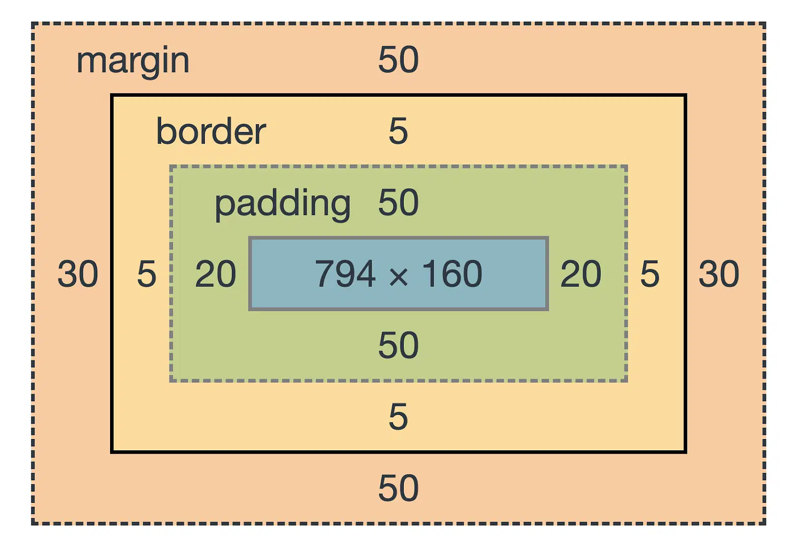
The CSS Box Model describes how every HTML element is represented as a rectangular box. It defines the layout and spacing of elements on a web page.
Every box consists of four parts: content, padding, borders and margins.
Content - The content of the box, where text and images appear
Padding - Clears an area around the content. The padding is transparent
Border - A border that goes around the padding and content
Margin - Clears an area outside the border. The margin is transparent
  <!DOCTYPE html>
  <html>
  <head>
    <style>
      div {
        width: 200px;
        height: 200px;
        padding: 20px;
        border: 5px solid blue;
        margin: 30px;
        background-color: lightyellow;
      }
    </style>
  </head>
  <body>
    <h2>CSS Box Model Example</h2>
    <div>
      This is a box model demo. Notice content, padding, border, and margin.
    </div>
  </body>
  </html>
The CSS padding properties are used to generate space around an element's content, inside of any defined borders.
Padding - Individual Sides
| Property | Description |
|---|---|
| padding-top | Sets the padding at the top of the element |
| padding-right | Sets the padding at the right side of the element |
| padding-bottom | Sets the padding at the bottom of the element |
| padding-left | Sets the padding at the left side of the element |
  <!DOCTYPE html>
  <html>
  <head>
    <style>
      div {
        border: 2px solid green;
        background-color: lightyellow;
        padding-top: 30px;
        padding-right: 50px;
        padding-bottom: 20px;
        padding-left: 10px;
      }
    </style>
  </head>
  <body>
    <h2>CSS Padding - Individual Sides</h2>
    <div>
      This box has different padding on each side.
    </div>
  </body>
  </html>
Padding - Shorthand Property
| Values | Description |
|---|---|
| padding: 20px; | All four sides = 20px |
| padding: 10px 30px; | Top & Bottom = 10px, Left & Right = 30px |
| padding: 5px 15px 25px; | Top = 5px, Left & Right = 15px, Bottom = 25px |
| padding: 5px 10px 15px 20px; | Top = 5px, Right = 10px, Bottom = 15px, Left = 20px |
  <!DOCTYPE html>
  <html>
  <head>
    <style>
      div {
        border: 2px solid blue;
        background-color: lightyellow;
        padding: 20px;                /* all sides 20px */
        padding: 10px 30px;           /* top/bottom 10px, left/right 30px */
        padding: 5px 15px 25px;       /*  top 5px, left/right 15px, bottom 25px */
        padding: 5px 10px 15px 20px;  /*  top 5px, right 10px, bottom 15px, left 20px */
      }
    </style>
  </head>
  <body>
    <h2>CSS Padding - Shorthand</h2>
    <div>
      This box uses shorthand padding.
    </div>
  </body>
  </html>
The CSS border properties allow you to specify the style, width, and color of an element's border.
1. border-style (required) Property
2. border-width Property
3. border-color Property
The border-style property specifies what kind of border to display.
| Value | Description |
|---|---|
| dotted | Defines a dotted border |
| dashed | Defines a dashed border |
| solid | Defines a solid border |
| double | Defines a double border |
| groove | Defines a 3D grooved border (depends on border-color) |
| ridge | Defines a 3D ridged border (depends on border-color) |
| inset | Defines a 3D inset border (depends on border-color) |
| outset | Defines a 3D outset border (depends on border-color) |
| none | Defines no border |
| hidden | Defines a hidden border |
The border-style property can be applied individually to each side of an element:
| Property | Description |
|---|---|
| border-top-style | Defines the style of the top border |
| border-right-style | Defines the style of the right border |
| border-bottom-style | Defines the style of the bottom border |
| border-left-style | Defines the style of the left border |
  <!DOCTYPE html>
  <html>
  <head>
    <style>
      div {
        border-top-style: dotted;
        border-right-style: solid;
        border-bottom-style: dashed;
        border-left-style: double;
        border-width: 4px;
        border-color: blue;
        padding: 10px;
        margin: 10px;
      }
    </style>
  </head>
  <body>

    <h2>CSS Border Style - Individual Sides</h2>

    <div>
      This box has different border styles on each side.
    </div>

  </body>
  </html>
The border-style property allows you to set the style of all four sides at once.
| Shorthand | Meaning |
|---|---|
| border-style: solid; | All four sides = solid |
| border-style: dotted dashed; | Top & Bottom = dotted, Left & Right = dashed |
| border-style: solid dotted dashed; | Top = solid, Left & Right = dotted, Bottom = dashed |
| border-style: solid dotted dashed double; | Top = solid, Right = dotted, Bottom = dashed, Left = double |
  <!DOCTYPE html>
  <html>
  <head>
    <style>
      .box1 { border-style: solid; }
      .box2 { border-style: dotted dashed; }
      .box3 { border-style: solid dotted dashed; }
      .box4 { border-style: dotted solid dashed double; }
    </style>
  </head>
  <body>

    <h2>CSS Border Style Shorthand Example</h2>

    <div class="box1">1 value → solid on all sides</div>
    <br>
    <div class="box2">2 values → dotted (top/bottom), dashed (left/right)</div>
    <br>
    <div class="box3">3 values → solid (top), dotted (left/right), dashed (bottom)</div>
    <br>
    <div class="box4">4 values → dotted (top), solid (right), dashed (bottom), double (left)</div>

  </body>
  </html>
The border-width property sets the width (thickness) of an element's border.
| Value | Description |
|---|---|
| thin | Defines a thin border (browser-dependent) |
| medium | Defines a medium border (default) |
| thick | Defines a thick border (browser-dependent) |
| length (e.g., 5px, 2em) | Defines an exact border width |
It can be applied to all sides individually (top, right, bottom, left).
| Property | Description |
|---|---|
| border-top-width | Sets the width of the top border |
| border-right-width | Sets the width of the right border |
| border-bottom-width | Sets the width of the bottom border |
| border-left-width | Sets the width of the left border |
  <!DOCTYPE html>
  <html>
  <head>
    <style>
      div {
        border-style: solid;
        border-top-width: 2px;
        border-right-width: 4px;
        border-bottom-width: 6px;
        border-left-width: 8px;
        border-color: blue;
        padding: 10px;
        margin: 10px;
      }
    </style>
  </head>
  <body>

    <h2>CSS Border Width - Individual Sides Example</h2>

    <div>
      Top = 2px, Right = 4px, Bottom = 6px, Left = 8px
    </div>

  </body>
  </html>
The border-width shorthand property allows you to set the width of all four borders in a single statement.
| Shorthand | Meaning |
|---|---|
| border-width: 20px; | All four sides = 20px |
| border-width: 10px 30px; | Top & Bottom = 10px, Left & Right = 30px |
| border-width: 5px 15px 25px; | Top = 5px, Left & Right = 15px, Bottom = 25px |
| border-width: 5px 10px 15px 20px; | Top = 5px, Right = 10px, Bottom = 15px, Left = 20px |
  <!DOCTYPE html>
  <html>
  <head>
    <style>
      .box1 { border-style: solid; border-width: 20px; }
      .box2 { border-style: solid; border-width: 10px 30px; }
      .box3 { border-style: solid; border-width: 5px 15px 25px; }
      .box4 { border-style: solid; border-width: 5px 10px 15px 20px; }
    </style>
  </head>
  <body>

    <h2>CSS Border-Width Shorthand Example</h2>

    <div class="box1">All sides = 20px</div>
    <br>
    <div class="box2">Top & Bottom = 10px, Left & Right = 30px</div>
    <br>
    <div class="box3">Top = 5px, Left & Right = 15px, Bottom = 25px</div>
    <br>
    <div class="box4">Top = 5px, Right = 10px, Bottom = 15px, Left = 20px</div>

  </body>
  </html>
The border-color property sets the color of an element's border.
| Property / Value | Description |
|---|---|
| border-color: red; | All four sides = red (color name) |
| border-color: #00ff00; | All four sides = green (HEX) |
| border-color: rgb(0,0,255); | All four sides = blue (RGB) |
| border-color: rgba(255,0,0,0.5); | All four sides = semi-transparent red (RGBA) |
The border-color property can be applied individually to each side
| Property | Description |
|---|---|
| border-top-color | Sets the color of the top border |
| border-right-color | Sets the color of the right border |
| border-bottom-color | Sets the color of the bottom border |
| border-left-color | Sets the color of the left border |
  <!DOCTYPE html>
  <html>
  <head>
    <style>
      div {
        border-style: solid;
        border-top-color: red;
        border-right-color: green;
        border-bottom-color: blue;
        border-left-color: orange;
        border-width: 5px;
        padding: 10px;
        margin: 10px;
      }
    </style>
  </head>
  <body>

    <h2>CSS Border-Color Individual Sides Example</h2>

    <div>
      Top = red, Right = green, Bottom = blue, Left = orange
    </div>

  </body>
  </html>
The border-color shorthand property allows you to set the colors of all four borders in a single statement.
| Shorthand | Meaning |
|---|---|
| border-color: red; | All four sides = red |
| border-color: red green; | Top & Bottom = red, Left & Right = green |
| border-color: red green blue; | Top = red, Left & Right = green, Bottom = blue |
| border-color: red green blue orange; | Top = red, Right = green, Bottom = blue, Left = orange |
  <!DOCTYPE html>
  <html>
  <head>
    <style>
      .box1 { border-style: solid; border-width: 5px; border-color: red; padding: 10px; }
      .box2 { border-style: solid; border-width: 5px; border-color: red green; padding: 10px; }
      .box3 { border-style: solid; border-width: 5px; border-color: red green blue; padding: 10px; }
      .box4 { border-style: solid; border-width: 5px; border-color: red green blue orange; padding: 10px; }
    </style>
  </head>
  <body>

    <h2>CSS Border-Color Shorthand Example</h2>

    <div class="box1">All sides = red</div>
    <br>
    <div class="box2">Top & Bottom = red, Left & Right = green</div>
    <br>
    <div class="box3">Top = red, Left & Right = green, Bottom = blue</div>
    <br>
    <div class="box4">Top = red, Right = green, Bottom = blue, Left = orange</div>

  </body>
  </html>
The border shorthand property allows you to set border-width, border-style, and border-color in a single statement width → style → color
| Property | Description |
|---|---|
| border-top | Sets the width, style, and color of the top border |
| border-right | Sets the width, style, and color of the right border |
| border-bottom | Sets the width, style, and color of the bottom border |
| border-left | Sets the width, style, and color of the left border |
| border | Sets the width, style, and color of all borders |
  <!DOCTYPE html>
  <html>
  <head>
    <style>
      .box {
        border-top: 5px solid red;
        border-right: 8px dashed green;
        border-bottom: 3px dotted blue;
        border-left: 6px double orange;
        padding: 20px;
        margin: 20px;
      }
    </style>
  </head>
  <body>

    <h2>CSS Border Individual Sides Example</h2>

    <div class="box">
      Top = 5px solid red, Right = 8px dashed green, Bottom = 3px dotted blue, Left = 6px double orange
    </div>

  </body>
  </html>
The border-radius property is used to round the corners of an element border.
| Property | Description |
|---|---|
| border-top-left-radius | Rounds only the top-left corner |
| border-top-right-radius | Rounds only the top-right corner |
| border-bottom-right-radius | Rounds only the bottom-right corner |
| border-bottom-left-radius | Rounds only the bottom-left corner |
  <!DOCTYPE html>
  <html>
  <head>
    <style>
      .box {
        width: 150px;
        height: 150px;
        background: orange;
        border-top-left-radius: 30px;
        border-top-right-radius: 10px;
        border-bottom-right-radius: 50px;
        border-bottom-left-radius: 5px;
        padding: 20px;
        margin: 20px;
      }
    </style>
  </head>
  <body>

    <h2>CSS Border-Radius Individual Corners Example</h2>

    <div class="box">
      Top-Left = 30px, Top-Right = 10px, Bottom-Right = 50px, Bottom-Left = 5px
    </div>

  </body>
  </html>
The border-radius shorthand property allows you to set all four corners in a single statement.
| Shorthand | Meaning |
|---|---|
| border-radius: 10px; | All four corners = 10px |
| border-radius: 10px 20px; | Top-left & Bottom-right = 10px, Top-right & Bottom-left = 20px |
| border-radius: 10px 20px 30px; | Top-left = 10px, Top-right & Bottom-left = 20px, Bottom-right = 30px |
| border-radius: 10px 20px 30px 40px; | Top-left = 10px, Top-right = 20px, Bottom-right = 30px, Bottom-left = 40px |
  <!DOCTYPE html>
  <html>
  <head>
    <style>
      .box1 { width: 100px; height: 100px; background: red; border-radius: 10px; margin: 10px; }
      .box2 { width: 100px; height: 100px; background: green; border-radius: 10px 20px; margin: 10px; }
      .box3 { width: 100px; height: 100px; background: blue; border-radius: 10px 20px 30px; margin: 10px; }
      .box4 { width: 100px; height: 100px; background: orange; border-radius: 10px 20px 30px 40px; margin: 10px; }
    </style>
  </head>
  <body>

    <h2>CSS Border-Radius Shorthand Example</h2>

    <div class="box1">10px</div>
    <div class="box2">10px 20px</div>
    <div class="box3">10px 20px 30px</div>
    <div class="box4">10px 20px 30px 40px</div>

  </body>
  </html>
The margin property is used to create space around elements, outside of their borders.
The margin property can also be applied individually to each side using:
| Property | Description |
|---|---|
| margin-top | Sets margin on the top side |
| margin-right | Sets margin on the right side |
| margin-bottom | Sets margin on the bottom side |
| margin-left | Sets margin on the left side |
  <!DOCTYPE html>
  <html>
  <head>
    <style>
      .box {
        width: 150px;
        height: 100px;
        background: orange;
        margin-top: 20px;
        margin-right: 40px;
        margin-bottom: 10px;
        margin-left: 30px;
      }
    </style>
  </head>
  <body>

    <h2>CSS Margin Individual Sides Example</h2>

    <div class="box">
      Top = 20px, Right = 40px, Bottom = 10px, Left = 30px
    </div>

  </body>
  </html>
The margin shorthand property allows you to set all four sides’ margins in a single statement.
| Shorthand | Meaning |
|---|---|
| margin: 10px; | All four sides = 10px |
| margin: 10px 20px; | Top & Bottom = 10px, Left & Right = 20px |
| margin: 5px 10px 15px; | Top = 5px, Left & Right = 10px, Bottom = 15px |
| margin: 5px 10px 15px 20px; | Top = 5px, Right = 10px, Bottom = 15px, Left = 20px |
  <!DOCTYPE html>
  <html>
  <head>
    <style>
      .box1 { width: 100px; height: 100px; background: red; margin: 10px; }
      .box2 { width: 100px; height: 100px; background: green; margin: 10px 20px; }
      .box3 { width: 100px; height: 100px; background: blue; margin: 5px 10px 15px; }
      .box4 { width: 100px; height: 100px; background: orange; margin: 5px 10px 15px 20px; }
    </style>
  </head>
  <body>

    <h2>CSS Margin Shorthand Example</h2>

    <div class="box1">10px</div>
    <div class="box2">10px 20px</div>
    <div class="box3">5px 10px 15px</div>
    <div class="box4">5px 10px 15px 20px</div>

  </body>
  </html>
| Property | Description |
|---|---|
| width | Sets the width of an element |
| height | Sets the height of an element |
| max-width | Sets the maximum width an element can grow |
  <!DOCTYPE html>
  <html>
  <head>
    <style>
      .box1 {
        width: 300px;
        height: 150px;
        background: red;
        margin: 10px;
      }
      .box2 {
        width: 50%;
        height: 100px;
        background: green;
        margin: 10px;
      }
      .box3 {
        width: 100%;
        max-width: 400px;
        height: 120px;
        background: blue;
        margin: 10px;
      }
    </style>
  </head>
  <body>

    <h2>CSS Height, Width, Max-Width Example</h2>

    <div class="box1">width: 300px; height: 150px;</div>
    <div class="box2">width: 50%; height: 100px;</div>
    <div class="box3">width: 100%; max-width: 400px; height: 120px;</div>

  </body>
  </html>
The overflow property specifies what happens if content overflows the element’s box (i.e., content is larger than the defined width/height).
| Value | Description |
|---|---|
| visible | Default. Content is not clipped and may overflow outside the box |
| hidden | Overflowing content is clipped and not visible |
| scroll | Overflowing content is clipped, but scrollbars are always visible |
| auto | Overflowing content is clipped, but scrollbars appear only when needed |
  <!DOCTYPE html>
  <html>
  <head>
    <style>
      .box {
        width: 200px;
        height: 100px;
        border: 2px solid #333;
        margin: 10px;
        padding: 10px;
      }
      .visible { overflow: visible; background: #f8d7da; }
      .hidden { overflow: hidden; background: #d1ecf1; }
      .scroll { overflow: scroll; background: #d4edda; }
      .auto { overflow: auto; background: #fff3cd; }
    </style>
  </head>
  <body>

    <h2>CSS Overflow Example</h2>

    <div class="box visible">Overflow visible: Content may go outside the box if too long. Lorem ipsum dolor sit amet.</div>
    <div class="box hidden">Overflow hidden: Content is clipped and not visible. Lorem ipsum dolor sit amet.</div>
    <div class="box scroll">Overflow scroll: Scrollbars always visible. Lorem ipsum dolor sit amet.</div>
    <div class="box auto">Overflow auto: Scrollbars appear only if needed. Lorem ipsum dolor sit amet.</div>

  </body>
  </html>
CSS provides several properties to style HTML lists (ul, ol, li) such as list markers, positions, and styles.
| Property | Description |
|---|---|
| list-style-type | Specifies the type of list marker (disc, circle, square, decimal, etc.) |
| list-style-position | Specifies whether the marker is inside or outside the list item |
| list-style-image | Specifies an image as the list marker instead of a bullet |
| list-style | Shorthand for setting type, position, and image in one declaration |
  <!DOCTYPE html>
  <html>
  <head>
    <style>
      ul.disc { list-style-type: disc; }
      ul.circle { list-style-type: circle; }
      ul.square { list-style-type: square; }
      ul.decimal { list-style-type: decimal; }
      ul.inside { list-style-position: inside; }
      ul.outside { list-style-position: outside; }
      ul.image { list-style-image: url('bullet.png'); }
    </style>
  </head>
  <body>

    <h2>CSS List Properties Example</h2>

    <ul class="disc">
      <li>Disc Marker</li>
      <li>Item 2</li>
    </ul>

    <ul class="circle">
      <li>Circle Marker</li>
      <li>Item 2</li>
    </ul>

    <ul class="square">
      <li>Square Marker</li>
      <li>Item 2</li>
    </ul>

    <ul class="decimal">
      <li>Decimal Marker</li>
      <li>Item 2</li>
    </ul>

    <ul class="inside">
      <li>Inside Marker</li>
      <li>Item 2</li>
    </ul>

    <ul class="outside">
      <li>Outside Marker</li>
      <li>Item 2</li>
    </ul>

    <ul class="image">
      <li>Image Marker</li>
      <li>Item 2</li>
    </ul>

  </body>
  </html>
The position property specifies how an element is positioned in the document.
| Value | Description |
|---|---|
| static | Default. Element follows normal document flow |
| relative | Element is positioned relative to its normal position |
| absolute | Element is positioned relative to the nearest positioned ancestor |
| fixed | Element is positioned relative to the viewport and stays on scroll |
| sticky | Element toggles between relative and fixed depending on scroll position |
  <!DOCTYPE html>
  <html>
  <head>
    <style>
      .static-box {
        position: static;
        background: #f8d7da;
        padding: 20px;
        margin: 10px;
      }
      .relative-box {
        position: relative;
        top: 10px;
        left: 20px;
        background: #d1ecf1;
        padding: 20px;
        margin: 10px;
      }
      .absolute-box {
        position: absolute;
        top: 50px;
        left: 250px;
        background: #d4edda;
        padding: 20px;
      }
      .fixed-box {
        position: fixed;
        bottom: 10px;
        right: 10px;
        background: #fff3cd;
        padding: 20px;
      }
      .sticky-box {
        position: sticky;
        top: 0;
        background: #cce5ff;
        padding: 20px;
        margin-bottom: 200px;
      }
    </style>
  </head>
  <body>

    <h2>CSS Position Example</h2>

    <div class="static-box">Static Position</div>
    <div class="relative-box">Relative Position</div>
    <div class="absolute-box">Absolute Position</div>
    <div class="fixed-box">Fixed Position</div>
    <div class="sticky-box">Sticky Position</div>

    <p>Scroll down to see the effect of sticky and fixed positions.</p>
    <p style="height:500px;"></p>

  </body>
  </html>
The z-index property controls the stacking order of positioned elements.
Higher z-index values appear on top of elements with lower values.
  <!DOCTYPE html>
  <html>
  <head>
    <style>
      .box {
        width: 150px;
        height: 150px;
        position: absolute;
        padding: 20px;
        color: white;
        font-weight: bold;
        text-align: center;
        line-height: 110px;
      }
      .red { background: red; top: 50px; left: 50px; z-index: 1; }
      .green { background: green; top: 100px; left: 100px; z-index: 3; }
      .blue { background: blue; top: 150px; left: 150px; z-index: 2; }
    </style>
  </head>
  <body>

    <h2>CSS Z-Index Example</h2>

    <div class="box red">Red (z-index:1)</div>
    <div class="box green">Green (z-index:3)</div>
    <div class="box blue">Blue (z-index:2)</div>

  </body>
  </html>
CSS has a lot of properties for styling and formatting text.
| Property | Description |
|---|---|
| text-align | Aligns text horizontally: left, right, center, justify |
| vertical-align | Aligns inline or table-cell elements vertically: baseline, top, middle, bottom |
| color | Sets the text color |
| text-decoration | Adds underline, overline, line-through, or none |
| text-transform | Changes text case: uppercase, lowercase, capitalize |
| text-indent | Indents the first line of a block of text |
| letter-spacing | Sets spacing between letters |
| word-spacing | Sets spacing between words |
| line-height | Sets height of a line of text |
| word-wrap / overflow-wrap | Specifies how long words should be broken and wrapped: normal, break-word |
| word-break | Specifies line breaking rules: normal, break-all, keep-all |
| writing-mode | Defines text flow direction: horizontal-tb, vertical-rl, vertical-lr |
| text-shadow | Adds shadow to text (horizontal offset, vertical offset, blur, color) |
  <!DOCTYPE html>
  <html lang="en">
  <head>
    <meta charset="UTF-8">
    <meta name="viewport" content="width=device-width, initial-scale=1.0">
    <title>CSS Text Properties Example</title>
    <style>
      .text-box {
        width: 400px;
        padding: 20px;
        border: 2px solid #333;
        margin: 20px auto;
        background: #f9f9f9;
        font-size: 18px;
      }

      /* Different properties */
      .align { text-align: center; }
      .v-align span { vertical-align: super; }
      .color { color: darkblue; }
      .decoration { text-decoration: underline overline; }
      .transform { text-transform: uppercase; }
      .indent { text-indent: 50px; }
      .letter { letter-spacing: 5px; }
      .word { word-spacing: 20px; }
      .line { line-height: 2; }
      .wrap { overflow-wrap: break-word; }
      .break { word-break: break-all; }
      .white { white-space: pre-line; }
      .writing { writing-mode: vertical-rl; }
      .shadow { text-shadow: 2px 2px 5px gray; }
    </style>
  </head>
  <body>
    <div class="text-box align">This text is center aligned.</div>
    <div class="text-box v-align">Normal <span>Super</span> aligned text.</div>
    <div class="text-box color">This text is dark blue.</div>
    <div class="text-box decoration">This has underline and overline.</div>
    <div class="text-box transform">this becomes uppercase.</div>
    <div class="text-box indent">This paragraph has a first-line indent.</div>
    <div class="text-box letter">Letter spaced text.</div>
    <div class="text-box word">Word spaced text.</div>
    <div class="text-box line">This text has double line height.<br>See the spacing.</div>
    <div class="text-box wrap">Supercalifragilisticexpialidociouslongwordthatwillbreakproperly</div>
    <div class="text-box break">Supercalifragilisticexpialidociouslongwordthatwillbreak</div>
    <div class="text-box white">This     text preserves
  multiple spaces and line breaks.</div>
    <div class="text-box writing">Vertical Text Direction.</div>
    <div class="text-box shadow">Text with shadow effect.</div>
  </body>
  </html>
Fonts in CSS control the appearance of text including typeface, size, style, and weight.
| Property | Description |
|---|---|
| font-family | Specifies the font of the text (e.g., Arial, Times New Roman, serif, sans-serif). |
| font-style | Specifies the style of the text: normal, italic, or oblique. |
| font-weight | Specifies the thickness of the text: normal, bold, lighter, bolder, or numeric values (100–900). |
| font-size | Specifies the size of the font using units like px, em, %, or rem. |
| font (shorthand) | Shorthand property to set font-style, font-variant, font-weight, font-size/line-height, and font-family in one declaration. |
  <!DOCTYPE html>
  <html lang="en">
  <head>
    <meta charset="UTF-8">
    <title>CSS Font Properties Example</title>
    <style>
      .family {
        font-family: "Arial", sans-serif;
      }
      .style {
        font-style: italic;
      }
      .weight {
        font-weight: bold;
      }
      .size {
        font-size: 22px;
      }
      .shorthand {
        font: italic small-caps bold 20px/1.5 "Georgia", serif;
      }
    </style>
  </head>
  <body>
    <p class="family">This text uses <b>font-family</b>: Arial, sans-serif.</p>
    <p class="style">This text uses <b>font-style</b>: italic.</p>
    <p class="weight">This text uses <b>font-weight</b>: bold.</p>
    <p class="size">This text uses <b>font-size</b>: 22px.</p>
    <p class="shorthand">This text uses the <b>font shorthand</b> property.</p>
  </body>
  </html>
| Property | Possible Values / Description |
|---|---|
| border-collapse | collapse, separate – Specifies whether table borders are collapsed or separated. |
| border-spacing | length values (e.g., 10px, 1em) – Distance between borders of adjacent cells (works only if border-collapse: separate). |
| caption-side | top, bottom – Specifies the position of a table caption. |
| empty-cells | show, hide – Shows or hides borders/background of empty cells. |
| table-layout | auto, fixed – Defines the algorithm to layout table cells, rows, and columns. |
  <!DOCTYPE html>
  <html lang="en">
  <head>
    <meta charset="UTF-8">
    <title>Simple CSS Table Properties Example</title>
    <style>
      table {
        border-collapse: collapse; /* collapse or separate */
        table-layout: auto;         /* auto or fixed */
        width: 70%;                 /* width of the table */
      }

      th, td {
        border: 2px solid black;    /* border for cells */
        padding: 10px;
        vertical-align: middle;     /* top, middle, bottom */
        overflow: hidden;           /* hidden, scroll, visible */
        text-overflow: ellipsis;
        white-space: nowrap;
      }

      caption {
        caption-side: top;          /* top or bottom */
        font-weight: bold;
        margin-bottom: 10px;
      }

      td.empty {
        background-color: #f0f0f0;  /* simulate empty-cells property */
      }
    </style>
  </head>
  <body>

    <table>
      <caption>Student Marks</caption>
      <thead>
        <tr>
          <th>Name</th>
          <th>Math</th>
          <th>Science</th>
          <th>English</th>
        </tr>
      </thead>
      <tbody>
        <tr>
          <td>Rahul</td>
          <td>85</td>
          <td>90</td>
          <td>88</td>
        </tr>
        <tr>
          <td>Priya</td>
          <td>78</td>
          <td>88</td>
          <td>92</td>
        </tr>
        <tr>
          <td>Ankit</td>
          <td class="empty"></td>
          <td>85</td>
          <td>89</td>
        </tr>
        <tr>
          <td>Riya</td>
          <td>80</td>
          <td>95</td>
          <td class="empty"></td>
        </tr>
      </tbody>
    </table>

  </body>
  </html>
A Zebra Striped Table is a table where alternating rows have different background colors
To create a zebra-striped table, use the nth-child() selector and add a background-color to all even (or odd) table rows.
  <!DOCTYPE html>
  <html lang="en">
  <head>
  <meta charset="UTF-8">
  <title>Zebra Striped Table</title>
  <style>
    table {
      width: 80%;
      border-collapse: collapse;
      margin: 20px auto;
      font-family: Arial, sans-serif;
    }

    th, td {
      padding: 12px;
      text-align: left;
      border: 1px solid #ddd;
    }

    th {
      background-color: #4CAF50;
      color: white;
    }

    /* Zebra stripes: even rows */
    tr:nth-child(even) {
      background-color: #f2f2f2;
    }

    /* Hover effect */
    tr:hover {
      background-color: #ddd;
    }
  </style>
  </head>
  <body>

  <h2 style="text-align:center;">Zebra Striped Table Example</h2>

  <table>
    <tr>
      <th>Name</th>
      <th>Age</th>
      <th>City</th>
    </tr>
    <tr>
      <td>Deepak</td>
      <td>28</td>
      <td>Delhi</td>
    </tr>
    <tr>
      <td>Anita</td>
      <td>25</td>
      <td>Mumbai</td>
    </tr>
    <tr>
      <td>Ravi</td>
      <td>30</td>
      <td>Bangalore</td>
    </tr>
    <tr>
      <td>Sneha</td>
      <td>27</td>
      <td>Chennai</td>
    </tr>
  </table>

  </body>
  </html>